3. What kind of media institution might distribute your media product and why?
 A distributor is a company who is responsible for marketing and distributing films. They will choose which platform to release your film on and give a date for release. For example, one of the world leading distributors, Universal Pictures, are responsible for marketing and selling the release of films. For example, a production company like Original Film will go to Universal Pictures (because of their establishment) and synergise to release the film 'The Fast and Furious'. Depending on the films popularity, Universal Pictures will release the film on multiple platforms. In this case, 'The Fast and Furious' was released on Box Office, DVD and a variety of revenue streams. However it must be said that this film was produced in 2001, and since then platforms for films have developed into on-demand and other means of viewings. Which means that the release of 'Fast & Furious 6' would have been released on home media.
Who is going to distribute Anonymous?
Anonymous has been made to fit into the mainstream film sector. Due to this being the case, we are wanting to go down the traditional route of distributing a mainstream film. Unlike films such as 'A Field in England', where they distributed the film on all platforms simultaneously, we wanted to target a wide audience on a large scale. Don't get me wrong, simultaneous release is effective if you're an independent company and targeting a niche audience but in our case we were in a different scenario. Moreover it must said that the main difference between distribution of independent companies and major companies is that independent companies don't do vertical integration, which will therefore limit how they can market their film on a large scale.

20th Century Fox would be an ideal distributor for Anonymous. The reason for this is because they have the knowledge and a good reputation for distributing thriller films. For example, Taken (2009) made a domestic gross of $145,000,989. This clearly shows that Fox know exactly how to market these types of films. Moreover they already have an existing audience for Thriller films, and by using Fox, we as a production company can utilise their audience following.
How we are going to distribute Anonymous?
1) The Box Office
The Box Office is the most traditional but one of the most effective techniques of distributing a film. Cinemas
charge up to £15 for a viewing and are open all day. This means
that distributors will receive a large proportion of these
profits. By looking at this graph, we can see that the average ticket price in the U.S is rising every year. This therefore means that we can target regular cinema audiences so that we and Universal will receive as much revenue as possible.
2) DVD Release
However people who don't go to the cinema regularly because of the increase in price, etc will be able to find Anonymous on DVD. Customers who aren't willing to spend a lot of money at the cinema have the option to buy the film on DVD release instead. Nowadays, DVD are around the same price as one cinema viewing, which could therefore be a popular choice to many viewers. Nevertheless we still want to capitalise profit from cinema release, so we will release home cinema, etc 3 months after paths The Box Office opens.
3) On Demand & Streaming
 This method of distribution is the newest and becoming one of the most popular forms of viewing films. This is the cheapest way of watching a film. For example, membership for Netflix is £5.99 for a month, with over 1000 films to watch from.
However the drawbacks are that films are released onto these on-demand sites at least 5 years after the release date of the film. This is a potential market for Anonymous as we can put our film onto these websites when our sales in DVD's fall. The chart shows below the increase in memberships over the years, which therefore shows the potential scaleability of the market in the near future.
Research from Pearl & Dean:
Below shows the figures for the film San Andreas. From looking at these stats we can see that the audience population of this film is male dominated. This is generally due to the film being a thriller, action and crime based, which males are more attracted to this.
So why did we aim at this group specifically?
Firstly, I've always liked the fact that this genre naturally leaves questions and mystery to the audience, and because of this we wanted to create something that would embed the same characteristics. Another reason why be targeted this group specifically (Male & between the age of 17-24) was because this age group are more inclined to go to the cinema - especially on a opening weekend. Below shows this. These stats show that 15% of male aged 15-24 visit the cinema the most. This could be due to younger people preferring to go out instead of watching a film at home, and more willing to purchase the ever increasingly price for a cinema ticket.


 This is Katie Shore. She is 21 and lives in Brighton. Her occupation is a journalist/photographer for the local newspaper, hoping to move to London and work for a more prestigious paper. She also hopes to improve her skills in photography enough so that her pictures will be used in popular geographic magazines. She has a boyfriend that she met on a photography course in London called Craig, whom is 23 years old and lives in Oxford. She lives in a medium sized flat in Brighton near the pier with a few close friends and her family live in a house on the outskirts of Brighton. In her free time she enjoys taking photos, going on walks, hanging out with her friends and boyfriend, travelling and listening to music. Her favourite genre of music is indie pop and her favourite artist is Coldplay. Her favourite song is Yellow by Coldplay and she also enjoys Ben Howard and Jack Garratt. She buys her favourite artist's albums or any that she enjoys the songs of (Digipak). She loves listening to covers of songs by hardly known artists as they give an original spin on the lyrics. In regards to her preference of music video content, she enjoys watching more of an equal split between an interesting narrative with performance as it gets boring otherwise. This makes her a perfect audience member for our music video as she fits into the target age group and gender, in addition to this she enjoys the same genre and similar artists to the artist and theme we have chosen.

 I chose to analyse this magazine advertisement of the album ‘The Blueprint 3’ by Jay Z, as it is one of the very few advertisements (in the hip-hop genre) that don’t have an image of the artists face. I like the fact that the artist has kept the concept very simple but at the same time it is eye-catching to the viewer. All of Jay Z’s previous album covers and advertisements have included a image of himself. When Jay Z released this album in 2009, he didn’t incorporate an image of him; which could suggest and growth of establishment and fame that he has built up. This means that fans and the rest of his target audience doesn't need to see a image of his face as the name of the artist is all that is needed to sell the album. Below I have annotated the magazine advert; however I have still gone into further detail with some of the design features that the artistic designer has purposely carried out.

 In 2005 Coldplay released their fourth album, X&Y. Throughout the release of this album the band wanted to create a iconic image for the album. To the right is the album cover, which was designed by Tappin Gofton. Firstly looking at the album cover, we see a random collection of coloured blocks (which initially seems to have no meaning?). I’m sure fans of the band who purchased this album would of deciphered the endless possible meanings behind the cover art. However when Coldplay released this they wanted fans to do exactly that. This means that by creating a irrelevant cover art to the tracks that were included in the album still had the fans interested. Coldplay did however release the meaning behind the album art, a representation of the Baudot code. To many people, the ‘Baudot Code’ is unknown which means that Coldplay’s intentions for using this type of language was not to be recognised, but rather to be an art form that is open to interpretation. However, when you take the design to it’s raw bones, the baudot code spells ‘X&Y’.
 According to ‘Sven Carlson’ this music video acts as the ‘commercial exhibitionist’ as it gives a platform for the artist, Adele to market herself. The photo to the left is a perfect example for this. Here the camera positioned below and facing up towards her. This is a very conventional choice to make as a director as it gives the artist another dimension of superiority. Moreover, the corroborate that, the elegant use of lighting has a major factor to play as well. Both the unique backdrop and the spotlight aiming towards the camera helps with the portrayal of the artist. We as the fans, want to see the artist in her best image and by having external factors, such as the location, it will emphasis this even further and make her look more admirable. For example, At 0.58 we see a pedestal shot of the Royal Albert Hall. This is very significant as it creates further effect to show the artists sophistication which therefore reflects the nature of her performances. This effect is also helped by the constant sounds of excitement from the crowd.
 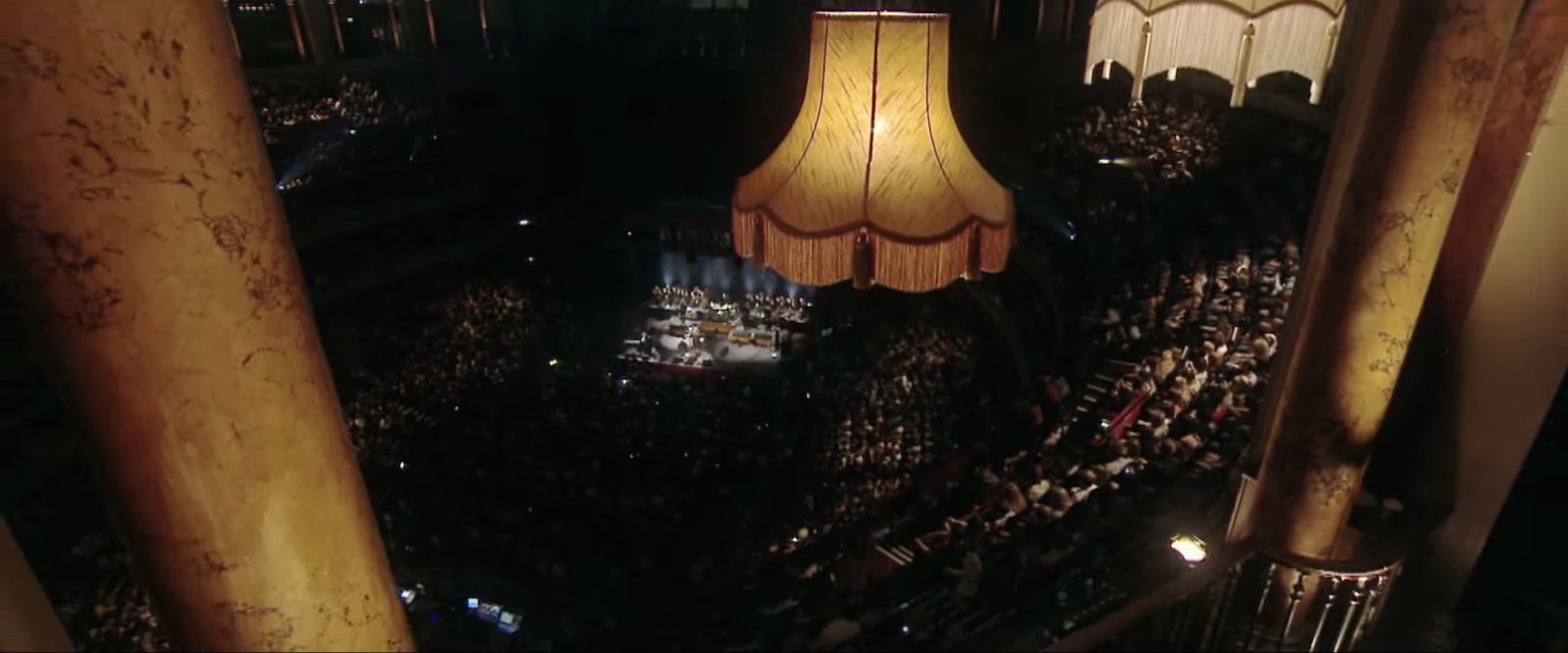 As with most music videos, the pictures of the video is cut to the beat of the music. When the ‘beat’ drops as such, Adele is always shown. The artist is taken up in most of the frame - further showing her significance. The editing has been done in this way to show her status and emotions to the song.
 Also since my preliminary task I have been able to widen my creativity with the use of camera shots. For example, at the start of the sequence the journey of the bag needed to be fast paced and not time consuming for the audience. This meant that, when the bag travelled from cookham to London we had to show this as quickly as possible. The most traditional way of showing this is the use of adding a transition between clips (which implies passing of time). Due to growth and confidence in the way I can film and edit since the preliminary task, we added physical transitions instead. This is a very effective technique as the transitions are within the footage, which therefore keeps the flow of action.
.png)

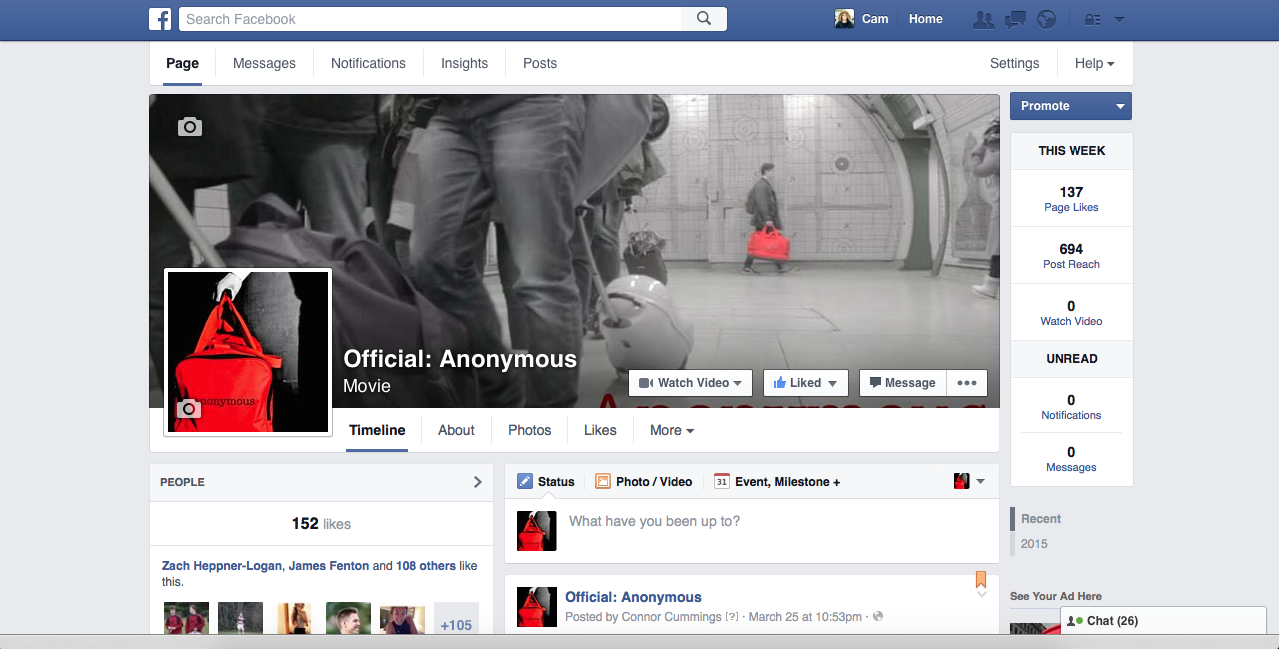 In addition to this, when we released the opening sequence to our film we wanted to promote the video to as many people as possible. Off the back of this, we have set up a Facebook Page for users to like and keep updated with the movie. Currently we have over 152likes, which is very beneficial for the promotion of our film.
 This is Matt Bartlett. He is from London and is 21years old. Matt is a website designer and based in Soho. He enjoys playing rugby and is a big fan of Chelsea FC. Matt lives in the heart of the city with his girlfriend, who likes to spend time with when he's not working! Both are huge film fans, especially thrillers, and regularly attend the cinema. Matt's favourite movie is 'Taken' because of the sheer terror and tension throughout the film. Matt is a perfect example of our target audience because he fits right into the age range as well as having high interest of the genre itself. Both him and his girlfriend are fans of Ben Howard and recently attended his gig at the O2 Apollo. Anonymous is about suspense and suspicion and these interests of Matt's are the reason why he becomes the ideal audience member.


