Below shows a filmed meeting that Louise and I had this morning regarding ideas for our music video. The discussion lasted an hour but to make it more interesting to watch we took most of the footage and put it into a time-lapse.
Wednesday, 30 September 2015
Treatment Presentation | Pre-Production
The other day we presented our treatment to our class. We went into thorough detail about the makeup of the video, e.g. location of filming, concept of video, desired target audience, etc. In addition to the video of the treatment below, I have included a copy of the Prezi presentation.
Tuesday, 29 September 2015


Monday, 28 September 2015
Album Advertisement Analysis 2 - The Blueprint 3 (Jay Z)
 I chose to analyse this magazine advertisement of the album ‘The Blueprint 3’ by Jay Z, as it is one of the very few advertisements (in the hip-hop genre) that don’t have an image of the artists face. I like the fact that the artist has kept the concept very simple but at the same time it is eye-catching to the viewer. All of Jay Z’s previous album covers and advertisements have included a image of himself. When Jay Z released this album in 2009, he didn’t incorporate an image of him; which could suggest and growth of establishment and fame that he has built up. This means that fans and the rest of his target audience doesn't need to see a image of his face as the name of the artist is all that is needed to sell the album. Below I have annotated the magazine advert; however I have still gone into further detail with some of the design features that the artistic designer has purposely carried out.
Design Concept: The main thrust of the album cover is the abundance of the white instruments mounted up. In addition to this, possibly the most eye-catching feature of the advert, three lines are overlaid onto the image. These lines represents the album number of the sequel, ‘Blueprint’. Having these two features as the main aspect of the advert works well as it suggests the artist uniqueness and creativity in his music.
This design has also followed the rule of thirds. The advertisement shows the artist and album name at the top, the album cover in the middle, and other information at the bottom. This shows how effective this design method is as appears on most advertisements. In addition to this, the layout of the advertisement is centred. This keeps it looking very simple but still professional.
Colour Scheme: Another reason why I find this advertisement very appealing is the choice of colour that has been chosen. Normally plain colours create a dull image, however this advertisement looks very modern and convincing because of the bold redness that has been incorporated in the album artwork. This therefore turns a simple and dull design into a modern and persuasive looking advert because the red acts as an component that keeps the audience engaged with the information being presented.

Sunday, 27 September 2015
Album Advertisement Analysis 1 - Only By The Night (Kings of Leon)
This ‘Kings of Leon’ advert was released in 2008 (in conjunction with the release of the album, 'Only By The Night'). ‘Kings of Leon’ typically follows the alternative rock genre in the music that they produce. This advert in particular reflects the band’s nature greatly, as the band are known for being unique in the way they market themselves, and this poster demonstrates this well. Here we can see that the group has followed the conventional method of advertisements, the rule of three. The top sections clearly highlights the bands name, the middle displays the album cover photo and the bottom gives more information about the album. Below I have analysed the different key features that the art designer has taken in consideration when producing this eye catching magazine advert.

Design Balance: The first thing that grabs your attention to this advertisement is the artwork. Most effective adverts will always have the album artwork being the forefront to the design. This means that everything shown will follow the design to the artwork. For example, this image shows the four members of the band being portrayed as one face. The artist has done this by splitting each face into quarters, which creates a square of symmetry. Therefore, the artistic director has followed this and arranged the typeface, target symbols and logos the same to keep the equilibrium.
Design Concept: In addition to having the band members faces shown, there is a discreet design of an eagle incorporated. This reflects the bands roots of being american as it's the countries national emblem. It could be said that the group incorporated the eagle into the design as it demonstrates long life, strength and majestic looks; which are qualities that the band aim for. Moreover, the design has a night vision look to it as target symbols and green grading has been added. This could further suggest the type of music that is in the album, for example, the meaning of the album could be being able to see through difficult times in life.
Magazine Information: Another main feature of this advertisement is the use of text information. The artistic director has put the name of the album in a large green font. This is effective as it matches the colour scheme to the rest of the magazine, which therefore keeps it consistent. Persuasive language has also been incorporated into the magazine. Persuasive information could be mentioning names that the album has received, the number of sales; however in this case the popular tracks of the album has been mentioned to remind the fans which songs are included. Moreover, the phrase 'OUT NOW' in red is also another form of grabbing their attention. This is telling the audience that the album is already available and reminding fans to buy the album as soon as possible. The two logos that have been placed in the corner of the magazine ad tell the audience further information about the album, such as the record label company. The bottom left logo tells fans where you can purchase the album from (play.com).
Magazine Information: Another main feature of this advertisement is the use of text information. The artistic director has put the name of the album in a large green font. This is effective as it matches the colour scheme to the rest of the magazine, which therefore keeps it consistent. Persuasive language has also been incorporated into the magazine. Persuasive information could be mentioning names that the album has received, the number of sales; however in this case the popular tracks of the album has been mentioned to remind the fans which songs are included. Moreover, the phrase 'OUT NOW' in red is also another form of grabbing their attention. This is telling the audience that the album is already available and reminding fans to buy the album as soon as possible. The two logos that have been placed in the corner of the magazine ad tell the audience further information about the album, such as the record label company. The bottom left logo tells fans where you can purchase the album from (play.com).
Saturday, 26 September 2015


Thursday, 24 September 2015
Album Cover Analysis 1 - X&Y (Coldplay)
 In 2005 Coldplay released their fourth album, X&Y. Throughout the release of this album the band wanted to create a iconic image for the album. To the right is the album cover, which was designed by Tappin Gofton. Firstly looking at the album cover, we see a random collection of coloured blocks (which initially seems to have no meaning?). I’m sure fans of the band who purchased this album would of deciphered the endless possible meanings behind the cover art. However when Coldplay released this they wanted fans to do exactly that. This means that by creating a irrelevant cover art to the tracks that were included in the album still had the fans interested. Coldplay did however release the meaning behind the album art, a representation of the Baudot code. To many people, the ‘Baudot Code’ is unknown which means that Coldplay’s intentions for using this type of language was not to be recognised, but rather to be an art form that is open to interpretation. However, when you take the design to it’s raw bones, the baudot code spells ‘X&Y’.
All of the singles that were released too still followed this concept. Below shows each single that was released alongside the album, and the album art that was included. Each single had a separate colour scheme but the same concept, which made it effective as the singles were still associated to the album.


Sunday, 20 September 2015
Friday, 18 September 2015
Thursday, 17 September 2015
Wednesday, 16 September 2015
Tuesday, 15 September 2015
Music Video Analysis 1 (Performance) - Adele
I chose this music video to analyse as I wanted to see how 'live performance' music videos can be constructed and why there's a purpose of making them. This video in particular, 'Set Fire To The Rain' (by Adele) is very eye catching due to the complementation of the visuals and sound. For example, at every instance the movement in the pictures is never idle. This means that the vast majority of shots has movement from either the camera or the performance itself, which will therefore keep the energy to the video. For example, at 1.00 we see a tracking shot behind the crowd. This is a very effective shot as it gets the audience involved, which not only keeps the energy to the video but creates a desire for the audience to be there.
 According to ‘Sven Carlson’ this music video acts as the ‘commercial exhibitionist’ as it gives a platform for the artist, Adele to market herself. The photo to the left is a perfect example for this. Here the camera positioned below and facing up towards her. This is a very conventional choice to make as a director as it gives the artist another dimension of superiority. Moreover, the corroborate that, the elegant use of lighting has a major factor to play as well. Both the unique backdrop and the spotlight aiming towards the camera helps with the portrayal of the artist. We as the fans, want to see the artist in her best image and by having external factors, such as the location, it will emphasis this even further and make her look more admirable. For example, At 0.58 we see a pedestal shot of the Royal Albert Hall. This is very significant as it creates further effect to show the artists sophistication which therefore reflects the nature of her performances. This effect is also helped by the constant sounds of excitement from the crowd.
 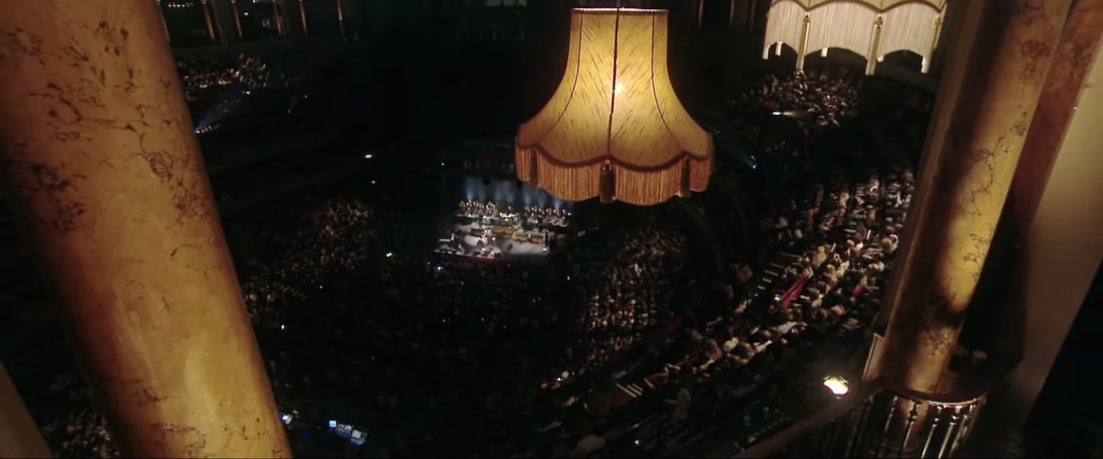 As with most music videos, the pictures of the video is cut to the beat of the music. When the ‘beat’ drops as such, Adele is always shown. The artist is taken up in most of the frame - further showing her significance. The editing has been done in this way to show her status and emotions to the song.
In my eyes, the overall aim of this video is to make fans want to experience the Artist perform live. This means that the video acts as a marketing tool for Adele and her concerts.
Monday, 14 September 2015
Deadline Dates | Pre-Production
Below shows the deadline dates for pre-production. All of the pre-production work has been deadlined to be completed by the end of October.
Saturday, 12 September 2015
Across the Pond (Short Film)
Over the summer, I created a new film called 'Across The Pond'. I thought it would be good to showcase this onto my A2 blog as I learnt new skills that may now be used in my A2 music video. For example, from learning how to do linear wipes in my preliminary task, which I then incorporated into this film. Below shows an example of when I used it in the film (0:21).

Subscribe to:
Posts (Atom)